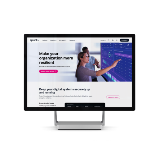
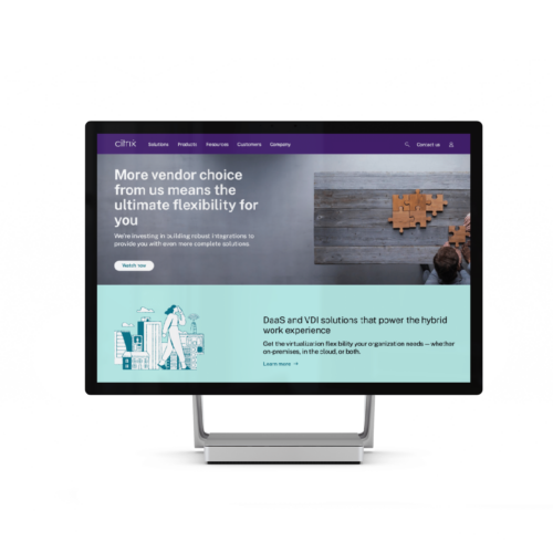
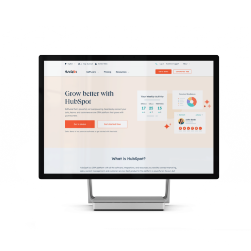
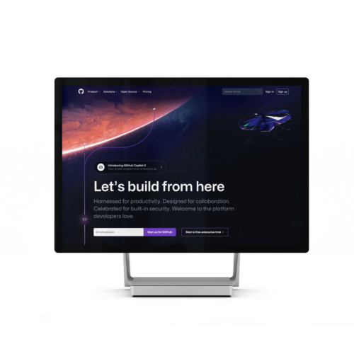
Do you need a new website for your business or a complete overhaul of your outdated one? A web design agency with a dedicated team of web design experts will help you get a brand new website.
But be aware: not all agencies in Sydney will be suitable for your needs.
Your business deserves a custom website design that consistently delivers great results, attracts the right prospects and drives lead generation and conversions, not just a basic web portal with your business’ name slapped on it.
So, how do you choose the right web development in Sydney?
This guide will make it easier for you to choose the right Sydney web design agency for your project.
Table of Contents
- Define Your Website Strategy
- Set Your Timeline and Budget
- Get a Consultation from Multiple Web Design Agencies
- Evaluate Their Approach to UX and Design in Website Development
- Understand How They Measure Success
- Review Their Portfolio
- Check Client Testimonials and Reviews
- Assess Their Communication and Project Management
- Ensure an Approach to SEO
- Mobile-Friendliness
- Understand Their Use of AI in Web Design
- Check the Content Management System (CMS) They Use
- Ongoing Support and Maintenance
- Ask About Their Testing Process
- Check if They Have any Digital Marketing Specialists on Their Team
- What are the Benefits of Hiring a Web Design Agency?
- Sydney Web Designers Frequently Asked Questions
1. Define Your Website Strategy
Before you start comparing web design agencies, it’s important to define your website strategy. This will make it much easier for you to understand your needs and choose a design agency capable of fulfilling these needs.
Here’s a rough checklist of what you need to include in your website strategy:
- Business objectives: Why do you need a website? How important is owning and managing a website important for your business?
- Target Audience: Who do you expect to visit your website and what do you need them to do when they land on it?
- Competitor analysis: Who are your competitors? What do their websites look like? What would make your prospects buy from you instead of your competitors?
Once you’ve drafted a comprehensive website strategy, search for a web design agency that can tailor a unique solution to turn this strategy into tangible results instead of one that offers a one-size-fits-all solution.
We recommend steering away from agencies that ask you to fill out a simple questionnaire or conduct a 10-minute call to learn about your needs and priorities—you need an agency that’s invested in your business success as much as you are. Look for a team of experts who are willing to engage in real conversations that help them create a customised solution based on your objectives, market dynamics, and target audience.
2. Set Your Timeline and budget
Before you begin your search for a web design agency, it’s important to set a realistic estimation of your budget and the date you expect your website to launch.
When deciding on a budget, it’s a good idea to set a range instead of a fixed amount to have multiple agency options. It’s also worth noting that not all agencies may be able to finish your project within your expected timeframe but sometimes may charge you extra if you’re in a hurry, like if you’re approaching a product launch or have a big event coming up.
Nevertheless, setting a budget ensures that the project’s costs never go out of hand and helps you narrow down potential web design agencies.
3. Get a Consultation from Multiple Web Design Agencies
If you want a strong online presence, you must choose the right web design agency for your business. The best approach here is to get consultations from multiple agencies to compare their services—merely checking their website and packages isn’t enough for you to make an informed decision.
Start by identifying a list of potential agencies and schedule consultations with each one. During these consultations, discuss your project’s goals, timeline, budget, and any specific requirements you may have. Consultations will also give you a good idea about the agency’s communication skills and how invested they are in understanding your needs.
Take notes when you can, and then compare between agencies based on the value they provide and how they can be the right fit for your project.
4. Evaluate Their Approach to UX and Design in Website Development
A website is more than just a bunch of eye-candy elements put together—you need a user-centric website that provides the best possible User experience (UX) and drives results.
To achieve this, look for a web design agency that understands the importance of UX in web design and treats it as a fundamental part of the design process.
For some agencies, UX is limited to “guessing” the appropriate locations for elements like menus and CTA buttons, but that doesn’t constitute even 5% of the UX design approach.
Ideally, you should be working with a web design agency that integrates UX-focused processes such as user research, interviews, and persona development into their web design strategy, as well as tailored designs that match your brand’s key messaging with your customers’ interests and needs to drive lead generation and closed deals.
The ultimate goal is to create a user journey that makes it easier for your prospects to find what they need quickly and eliminate complexity without compromising functionality. Avoid web designers that use pre-designed website templates or exclusively focus on visuals instead of functionality and user-centricity.
5. Understand How They Measure Success
Results-focused web design agencies measure their success with data-based analytics and insights. It should be a core part of the project, rather than an added service for extra costs.
Once a web design agency launches a website, they need to keep track of performance data from day one to understand how users navigate their website and identify possible areas of improvement.
For example, if your goal is lead generation, but a smaller number of prospects than expected are submitting their contact info, the design team should consider adjustments to form design, CTAs, and any other aspect that may influence a prospect’s decision to fill out the form.
If Google Search Console’s data is showing that your website is falling behind in terms of ranking, you could be dealing with a website speed or security issue.
Ask if the agency has a plan for pre-launch and post-launch analytics and whether their packages include performance audits. Check their portfolio to see if their past projects include conversion rates or the number of leads generated to get an idea of how much they value positive results.
If they outsource their analytics or don’t have a standardised success measurement process, there’s a good chance that they’re not invested in developing projects that yield results.
Key tools that can be utilised here include Google Tag Manager, Google Analytics 4, Google Ads tracking, and Google Search Console.
6. Review Their Portfolio
Taking a look at a web design agency’s portfolio will make it easier for you to decide if they’re the right fit for the job.
The portfolio should showcase how the agency tackled the project’s challenges and how that yielded a positive impact on the client’s business.
It’s also a big plus if the agency has worked with other clients in your industry. For instance, if your business model requires customers to book appointments, having previous experience with designing websites in your industry can help the agency ensure a seamless appointment booking experience for your customers.
On top of that, an agency with experience in your industry may be able to conduct a gap analysis between your competitors’ websites and your in-progress website, giving you a competitive edge in the market.
Other general factors to take note of include:
Brand Identity
When you visit one of their clients’ websites, are you able to quickly recognise their brand identity? The overall website’s design aesthetic and colour choices should match those of the client’s brand.
Use of Images
Choosing the right images and placing them in the right spots on your website can positively enhance its visual appeal and empower your key messaging. While browsing through the agency’s portfolio, observe how they use imagery in their clients’ websites. Are they just placing random images in random locations, or do they actually add something meaningful to the website’s design?
Website Structure
Your website’s structure should enable visitors to seamlessly navigate through it and find what they need without frustration.
You can test this on the websites that the agency has worked on in the past. Visit the website yourself and act like you’re a prospect who’s trying to find the business’ contact info, for example. You should be able to easily find it without going through countless menus and pages.
Page Loading Speed
Website speed is critical, both when it comes to the overall user experience and the website’s SEO. Check the agency’s portfolio websites and notice how fast pages load as you browse through the website’s different pages. You can also use a speed test tool like Google’s PageSpeed Insights tool.
With a faster website, you’ll be able to reduce bounce rates, increase conversions, and improve your visitors’ first impression of your business.
7. Check Client Testimonials and Reviews
Checking client testimonials is a great way to learn about a web design agency’s competency and quality of work.
However, it’s important to make sure that the testimonials aren’t fake, especially if they’re on the agency’s website. Ideally, you should only trust client testimonials on independent, third party review websites. An unbiased testimonial will include the drawbacks of working with the agency, not just the positives.
It’s hard to believe that everything in a particular web design project goes just as planned from start to finish, so make sure that the testimonials are detailed and real.
8. Assess Their Communication and Project Management
Evaluating a web design agency’s competency based on their technical expertise only isn’t enough to determine if they’re suitable to work with. Effective communication is also important to ensure timely and accurate submission of deliverables.
Here, it’s crucial to assess the agency’s project management capabilities. How efficient are they in handling day-to-day tasks? Were they responsive when you approached them? How long do they take to get back to you?
Moreover, you need to ask them how they take care of project timelines and the systems they use to manage their projects and handle client relationships. You should also inquire on how often you can expect to be updated on the development process.
9. Ensure An Approach to SEO
SEO (Search Engine Optimisation) involves a set of practices that increase a website’s visibility in search engines like Google and Bing for specific search keywords.
Typically, search engines reward authoritative websites that are fast, secure, and offer an exceptional user experience.
If a website isn’t designed from the ground up with SEO in mind, its chances of competing with more established websites are slim.
Look for a web design agency that treats SEO as an integral part of the website’s foundation instead of just a secondary concern. They should have at least one team member whose primary job is to optimise the website’s SEO.
If an agency’s idea of SEO is to install some SEO plugins and fill the website with random keywords without a strategy, this is a red flag that the agency lacks knowledge about SEO.
Ask if they will create a sitemap for your website, how they’ll structure the website’s hierarchy and content in accordance with SEO best practices, and whether they’ll carry out competitive keyword research before or after launch.
Your website should be easy to find and crawl by search engines, which can be achieved by adding metadata and optimising the website’s speed and structure.
10. Mobile-Friendliness
Adopting a mobile-friendly website is no longer a secondary concern—people now browse the web with their phones more than their desktop computers. In fact, up to 92% of Internet users visit websites from their mobile devices.
Not to mention, search engines reward websites designed with a mobile-first approach over websites that display and act awkwardly when accessed from phones.
Discuss the agency’s approach to responsive web design. Are their previous websites mobile-friendly and responsive? Are all the website’s functions equally easy to do on both mobiles and desktops? What about tablets?
11. Use of AI in Web Design
The Artificial Intelligence (AI) boom of the early 2020s has led companies in almost all tech industries to leverage its capabilities in their projects.
It provides great efficiency gains and enables fast and seamless data collection and analytics.
Consider asking the web design agency about their stance on AI usage. While AI provides a big leap forward in productivity, overreliance on AI can significantly compromise quality.
Ideally, the agency shouldn’t be 100% against the use of AI. At the same time, they aren’t supposed to be using it to build websites from the ground up with little input from their design team.
Instead, a web design agency that uses AI in supplementary tasks like content auditing and audience research will be able to finish your project faster without affecting the quality of the final product.
12. Check the Content Management System (CMS) They Use
Content Management Systems have made it easier for website administrators to upload and edit content with little to no technical background.
Almost all web design agencies will integrate a CMS into your website’s design to facilitate publishing content. However, not all CMS solutions provide a seamless user interface. Before signing the contract, consider inquiring about the CMS the agency uses in its projects. WordPress is one of the most popular and user-friendly content management systems.
13. Ongoing Support and Maintenance
A web design project doesn’t end with the agency launching your website. Websites need ongoing maintenance and support to ensure security and consistent performance and user experiences. Moreover, it’s very likely that some bugs will only unfold after launch, particularly when more people visit your website.
When comparing different web design firms, ask about their post-launch support policy. Is it included in the primary package? How fast is their support team? How long should you expect the agency to support your website? What are the fees for extending the scope of support?
14. Ask About Their Testing Process
A strict testing process is important to ensure that your website is working as expected and there aren’t any major bugs or performance hiccups that could affect user experience.
Ask about the agency’s testing procedures and how they can guarantee a successful website launch for you.
Ideally, they should be implementing a multi-stage testing process that involves:
- Unit testing: Involves testing individual website elements for bugs
- Integration testing: Tests the interconnected parts of the website to ensure they’re working appropriately
- User Acceptance Testing (UAT): The agency allows real users to test the website to spot any errors or problems that aren’t easily identifiable in the website’s code.
- Performance testing: Tests the website’s speed and stability.
In addition to pre-launch testing, the agency should be available to support your website and fix any issues or bugs that may arise.
15. Check if They Have any Digital Marketing Specialists on Their Team
In this day and age, web design isn’t just limited to creating a functional, eye-candy website; it’s actually considered an integral part of the marketing strategy. Having a website that supports and aligns with your marketing objectives is essential for generating more leads and increasing conversions.
So we recommend choosing a web design agency that also has experience in marketing or at least has marketing specialists on their team. Marketing professionals will provide insights into the website’s SEO, structure, integration with social media platforms, and content strategy. This way, you ensure that the website’s design doesn’t contradict with your marketing plans.
What Are the Benefits of Hiring a Web Design Agency?
Access an Entire Team of Experts
Building a website demands expertise from multiple individuals with different backgrounds.
The basics of a high-quality website include:
- A professional design
- high-quality content
- SEO optimisation
- A user-centric interface
- Post-launch maintenance
A web design agency provides you with a team of experts that knows how to perfectly execute these tasks.
Moreover, collaborating with professional web design agencies ensures that your website’s appearance aligns with your brand identity and meets your customers’ expectations.
They also typically have marketers and copywriters who create all the needed page content for your website, saving you the hassle of having to hire a copywriter.
Customise Your Website Based on Your Needs and Preferences
Competent web design agencies enable you to tailor your website to your business priorities, customer needs, and brand image.
The goal is to create a website that both looks good and aligns with your high-level objectives.
A web design agency will work closely with you to learn about your business requirements, target audience, and objectives. They use this information to create a website that meets your needs and helps achieve your goals.
Investing in professional, custom design offers several benefits:
- Enhance user engagement: A user-friendly website encourages visitors to spend more time on your website, creating a positive customer experience.
- Build a strong brand identity: A well-designed website aligns with your brand’s image and values, creating a memorable online presence that sets you apart from competitors.
- Get higher conversion rates: Professional web designers strategically use CTAs and other website elements to encourage conversions, turning prospects into customers.
Rank Higher in Search Engine Results
A professional web design agency with marketing expertise will be able to improve your website’s visibility in search engines, ensuring that your target customers are able to find your website when they search for your brand name or keywords related to your offerings.
With an SEO-proficient web design agency, you’ll have a fast, user-friendly website that leverages keywords effectively to reach local and international customers.
Increase Website Conversions
The primary goal of a website is to attract visitors and guide them toward specific actions, such as subscribing to a service or signing up for a newsletter.
If a website is complex or difficult to navigate, your prospects are likely to bounce off your website and turn to your competitors.
Professional web designers ensure that your website is designed to guide visitors toward desired actions, maximising conversions.
Improve Brand Image and Earn Customer Trust
Everyone can create a website on their own, with no-code website builders and content management systems making the process a whole lot easier for non-technical users.
However, without any real expertise in web design, you’ll likely run into website and user-experience problems that could drive customers away.
A professional web design agency will help you create a smooth, reliable website, boosting your brand image and helping you earn user trust.
Sydney Web Designers Frequently Asked Questions
What is a web design agency?
A web design agency is an organisation that builds websites for businesses. They have large teams with diverse technical and marketing backgrounds, as well as graphic designers, and content creators.
Web design agencies offer comprehensive web design solutions that include visuals, user experience, content, SEO optimisation, and in some cases, marketing strategies too.
What is the difference between web design and web development?
Web design is concerned with the visual and aesthetic aspects of a website—how it looks and feels to the user. The elements of the web design process include:
- Layout
- Colour schemes
- User experience
Web development, on the other hand, deals with the technical side of building a website., such as:
- Writing code
- Creating functionality
- API integrations
- Backend development
However, it’s important to note that a “web design” agency typically delivers you a complete, fully functional website that includes web development services, not just the user-facing part. They just happen to be called web design agencies, but they usually offer the full service of building websites from start to end as they typically have web developers on their team.
Should I hire a freelance web designer or a web development company?
The choice between hiring a freelance web designer and a web design agency depends on your specific needs and budget.
Hiring a freelance web designer can be a cost-effective solution for smaller projects or businesses with limited budgets. The advantages include personalized attention to your needs, flexibility, and better communication.
However, web design agencies offer a broader range of services and a team of experts who can handle larger, more complex projects.
Agencies can provide comprehensive support, including design, development, SEO, and ongoing maintenance, which are essential for business growth.
How long does it take a web design digital agency to launch a new website?
The time it takes to launch a new website varies greatly depending on the project’s complexity, the number of pages, and the features needed for a smooth user experience.
Typically, a basic website can take anywhere from 4 weeks all the way up to 8 weeks.
More advanced websites with custom features, API connections, online store capabilities, or extensive content can take from several months to up to a year.
For how long do web design agencies support websites after launch?
Support duration after the launch of a website varies depending on the agency and the support package you choose.
Many web design agencies offer a period of complimentary support, ranging from 30 to 90 days, to address any immediate issues or bugs. After this initial period, ongoing support is usually available through an ongoing website maintenance plan, which can include updates, security monitoring, backups, and technical support.
Make sure to discuss and understand the support options and costs before finalising your contract with the agency.
Filament: Your Trusted Web Design Partner
At Filament, we understand how competitive the B2B tech industry is in Sydney. Our goal is to design a top-tier website that enables you to meet customer expectations and gain a competitive edge in the market.
We offer holistic web design solutions tailored to the unique challenges of the B2B tech industry, ensuring minimal risk and maximum results. Our web design services include WordPress development, user-first navigation, mobile responsiveness, site speed optimisation, user-friendly content management systems, SEO integration, analytics tracking, and ongoing support.
With a proactive approach to web design, we continuously optimise and tweak websites for uncompromised performance.
Contact us today for a free consultation to discuss your website’s needs.


